We shall apply model-based clustering on the Old Faithful Geyser
data set. This data set is about a geyser situated in the
Yellowstone National Park in the USA:
It erupts intermittently. Careful record has been kept of
duration of each eruption as well as that of the waiting period
preceding it. This data set is part of R.
dim(faithful)
names(faithful)
The two variables store the durations in minutes.
plot(faithful)
The plot reveals two clusters. Apparently longer eruptions follow
longer waits. We shall see if model-based clustering also says
the same thing or not.
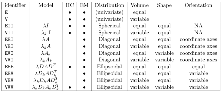
The type of clusters: EEE. We shall explain
this soon.
The number of clusters: G=2.
The Mclust function allows only (multi)normal
model. So the only freedom for the user to choose the type of
clusters lies in specifying the covariance matrices, which
controls the elliptic spread of the data. The following table
(taken from the vignette of the mclust package) gives the
complete list.
Let's peep inside the object returned by Mclust:
summary(faithfulMclust)
Unfortunately, it is not very informative. Here is a more verbose version:
summary(faithfulMclust,param=T)
Of course, we are naturally interested in which case is in which
cluster. This information must be there somewhere. Let's explore:
names(faithfulMclust)
The field called classification looks promising:
faithfulMclust$class
Unlike other clustering/classification techniques, model-based
clustering allows clusters to overlap. So there is obviously
uncertainty related to the clustering performed using this
method. This is stored as a number between 0 and 1
in the uncertainty field:
faithfulMclust$uncer
Remember that we had to specify three things: the data set, the
type of clusters required, and the number of clusters. Only the
first of these is compulsory. Mclust can figure out
the rest, if unspecified. Let's allow Mclust to
choose the optimal number of classes.
The summary is similar to what we had last time, except
that Mclust thinks that 3 clusters are better
than 2:
summary(faithfulMclust,param=T)
Let's make a plot:
plot(faithfulMclust)
The plot actually consists of 4 plots. The first plot
shows how Mclust chooses the optimal number of
clusters. It simply tries out model-based clustering for cluster
numbers ranging from 1 to 9, and chooses the one
with the maximum Bayesian Information Criterion (BIC) value:
max log-likelihood - log(n) number of free parameters estimated.
The first term measures how good the fit is, while the second
term measures how expensive it is (amount of data, and number of
estimations needed). The first plot shows BIC against different
cluster numbers.
The next plot is what we were yearning to see: the clusters shown
in different colours.
The third plot shows the levels of uncertainties. The big, black
dots correspond to the points with a high level of uncertainty.
The last plot shows the contour of the fitted mixture density.
The next invocation of Mclust supplies even less
information: just the data set. Here Mclust is
supposed to choose the best possible cluster shapes/sizes from
the list given earlier.
faithfulMclust = Mclust(faithful)
What has Mclust chosen for us? Let's see:
summary(faithfulMclust)
Well, it has chosen EEE with 3 clusters.
Playing with copula in R
There are a number of packages in R to work with copula. We shall
use the copula package:
library(copula)
What does this package allow us to do? A short answer is:
Creating a copula (from a fixed list)
Finding cdf, density (if it exists) of the copula
Generating random numbers from a copula
Making new multivariate distributions by combining user-specified
marginal distributions with a user-specified copula
Working with such distributions (fitting, finding cdf, pdf,
generating random numbers)
Creating a copula
The following line creates a copula from bivariate normal
distribution with correlation 0.9. Notice that the choice
of mean vector and the variances do not influence the copula (why?).
cop = normalCopula(dim = 2, param=0.9)

cop
You can extract the covariance matrix (useful for checking):
getSigma(cop)
Mathematically, a copula is a cdf. But R likes to think of a
copula as an object. Thus R talks about the cdf of a
copula:
pCopula(c(0.5,0.5),cop)
It is a good idea to check that this is correct. It should be
H(Φ-1 (x) , Φ-1 (y)),
where H is the cdf of the bivariate normal
distribution. If you are not sure where it came from let me
remind you that if H(x,y) is a cdf with continuous
marginals F(x) and G(y) then the copula
underlying H is
H ( F- (x) , G- (y) ).
The qnorm function of R
can already compute Φ-1. We shall use
the mvtnorm package to compute the bivariate normal
density H:
Plotting the copula (or rather its cdf) is a good way to
visualise a bivariate copula:
persp(cop,pCopula,xlim=c(-1,2),ylim=c(-1,2))
Of course, it was a stupid idea to plot a copula outside
the [0,1]×[0,1] box. We did it just to show that R
considers a copula as a function over this box only. So we can
safely avoid specifying the plotting region:
persp(cop,pCopula)
It's a pity that we cannot move this 3D plot interactively with
the mouse. But we can move it programmatically:
Next we shall head towards interactive 3D plots. The rgl
package will make such plots, but it needs us to supply the
heights of the surface over a grid of points. Fortunately,
the persp function returns these:
pts = persp(cop,dCopula)
When you are not sure about the structure of an R object
the str function is a good thing to try:
str(pts)
It shows that pts is a list of x values (a
vector), y values (another vector), and z values (a
matrix). Armed with these we load the rgl package:
library(rgl)
First we need to open a window for drawing 3D. It is different
from the traditional R graphics window:
open3d()
A small blank window will pop up. Let's add the surface using
the persp3d function:
with(pts,persp3d(x,y,z,color='grey'))
Not bad! Try dragging the surface with your mouse. However, the
surface is too shiny. This looks particularly ugly in a print
out. The shininess if caused by the default light used
by rgl. It is like a point source of light like an
electric bulb. We prefer something like a fluorescent light, more
diffuse. First let's turn off the existing light:
rgl.pop('lights')
The surface is now pitch dark. Next add a "soft" light:
rgl.light(specular='black')
Each light source has a specular aspect (like a bright point
source) as well as a diffuse aspect (soft glow).
The specular='black' turns of the specular part. Now
the surface will seem less shiny. It is also possible to choose
the surface material using the material3d function.
Plotting the contour of a surface is another way to visualise
it.
contour(cop,dCopula)
A contour plot can reveal curved ridges that may not be readily
visible in an interactive 3D plot.
Next let's generate some random numbers from a copula:
x = rCopula(100,cop)
dim(x)
Here is a scatterplot:
plot(x,xlim=c(0,1),ylim=c(0,1))
We could have done the same simulation even without explicitly
using a copula, because here the copula is very simple:
getSigma(cop)
y = rmvnorm(100,sigma=getSigma(cop))
Now just "fold back" the marginals:
u = pnorm(y)
and plot:
plot(u)
Different types of copula
R allows different types of copulas: Normal, t and
Archimedean. For both normal and t-copulas we have a rich
choice of correlation matrices. They may be
"unstructured" (general),
"exchangeable" (all off-diagonals equal),
"AR(1)" (all super diagonal elements are equal, the next
super diagonals are their squares, and so on),
The different forms required different number of parameters. For
example, both "exchangeable" and "AR(1)" require 1, while
"unstructured" requires d(d-1)/2, where d is the dimension.
The dispstr option is used to choose the structure:
Here again we can choose any of the above structures for the
correlation matrix. The default (used above) is "exchangeable".
R provides many useful families of Archimedean copulas, Clayton
copula being just one of them:
cop5 = claytonCopula(0.3, dim=2)
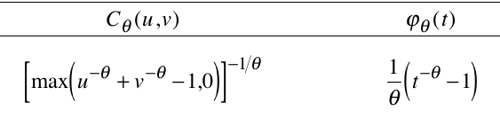
Here is the definition of the Clayton copula (and its generator)
from Nelsen's book:
Clayton copula
Combining marginals with a copula
The mvdc function combines marginals with a
copula. Below we create a bivariate distribution by plugging
normal marginals into the
Clayton copula just now created:
The last command uses the rgl package to make a 3D
scatterplot, where each point is shown as a sphere (ty='s').
That's all for this lab session. We shall learn about fitting a
copula later.